

Many website users struggle with images, even those that have managed a website for years. Here’s some straightforward things you can do to make your photo publishing weblife easier.
The image block is easy to use as is the gallery block. If you must combine text and images and want it to look the part use a pattern. Simply start a new para and /im will get the image block up.
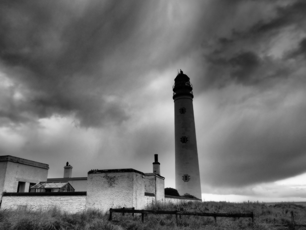
In the world of classic editing creating anything complicated become quickly very hard. Now it is easy enough to take a ready made block pattern and adapt it to your needs. But most of time just using a featured image (as shown above) will do.
Avoid using classic unless you are desperate for the limited retro editing experience.
A lot of image problems start before the website interface.
Phone or digital camera?
Even the cheapest digital camera or phone will offer multiple formats for taking snaps. The smallest file size may well let you store and potentially share many more pics, but the smallest size will be inadequate for many publishing purposes. Too small and the snaps will look grainy when enlarged or zoomed in and disappoint in print. It is not realistic to improve or crop a small image (less than 800px wide might be a rule of thumb, but twice that is fine).
Full size or RAW images give greater flexibility, but you’ll need more space to store the originals and convert to jpeg before uploading. While they may be way too big for instant web publishing, a large image is valuable insofar as it will be zoomable, can be cropped harder, will render well in print too and may even be subjected to judicious photoshopping to alter a color cast.
You’ll also see that if you download an image from our WordPress often it is in the webp format a relatively new compression, but already in widespread use. Don’t worry you can open it in Photoshop!
Light
An image shot in poor light or using the phone’s digital zoom may not render well on your page. In poor light the sensor adjusts automatically and reduces the quality of the image, unless you use manual settings. You’ll notice pixellation effects on the large screen, even without looking too closely, that were not perhaps so obvious on the phone. But if you are taking arty shots, poor light can be exploited to add dramatic effect – e.g. a lens flare or moody dark sky or pixellation for that retro early digital look.
If you use the camera’s digital zoom, you will lose detail in much the same way, avoid it – get closer or get a proper camera.
Frame
Frame your pics appropriately for your website. Landscape orientation is the best all round solution, but it depends a little on what you are aiming to do. Mugshots of the team might be better shot portrait or rendered round or square. Check too whether the snaps are in a strange aspect ratio (e.g. many phones use 20:9. For that long letterbox video look that is great on your home widescreen, but may not work so well for basic pictures).
Stick to 4:3 or 3:2 for your project. The 16:9 video format is also OK for images, but in landscape. Use it in portrait only if you want to look like the cool kid on the block. Be consistent don’t mix and match ratios and orientations, as most of the time it’ll not look good and makes it harder for you to assemble multiple images in a gallery, unless the gallery magically re-crops everything. There are no hard an fast rules, and rules are for breaking – but you have to be good to break them elegantly.
Size
Some applications let you save for web publishing. But what if you just have an image someone sent you? The rules are not hard and fast, but a “featured image” (this is the one at the top of you post/page built in to the template) should be at very least 1200px wide. I would err on the safe side and go for 1800px or more. Invest in a package to help you manage the processing steps, and remember to respect the cropping options – don’t try and do it by eye. WordPress also creates the intermediate sizes for you, so you don’t have to waste time creating thumbnails. If someone sends you an official photograph and it is too small or just wrong, ask them to resend and if they have it the the original. It is your website.
One picture or 2?
A picture is worth a thousand words, or so goes the saying, but too many might dilute your message and increase the time it takes to optimise and process, name and display and load a page for the unsuspecting user at the end of a PAYG phone (like me). Select the images with care and attention to what you are trying to say. Don’t dump them on the server, it is not a good place to store your life (but neither are social media platforms).
Aside
This aside uses a classic block.
 In classic WordPress the image can be positioned relative to the text right or left or above it. The default, strangely, always gives unsatisfactory results, yet few realise that they can fix this. If practice the old way is a bit fiddly when manipulating multiple images (impossible to reliably lay out rows and columns) but can be useful as you can get the text to flow around an object like this without thinking about layout. The trick is to keep layouts simple. The latest WordPress is obsessed with layout and the options are by contrast almost as baffling as they are wide.
How to look good
- If your template supports it always use a featured image option – it will display as the template author intended and moreover news feeds, social media and search tools like Android’s Discover will be able to find it
- If you do not use the featured image some feeds will grab the first image found, so make sure that that the first one is suitable and gives the right message
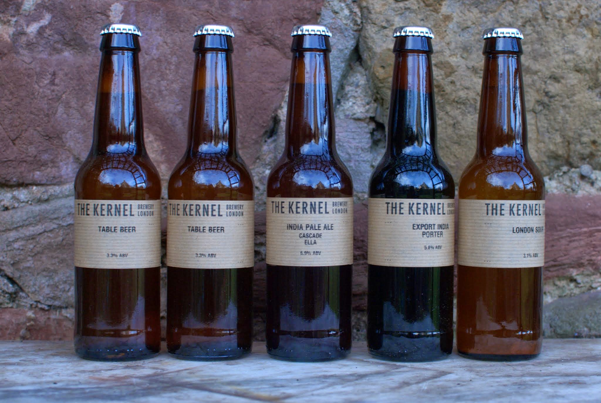
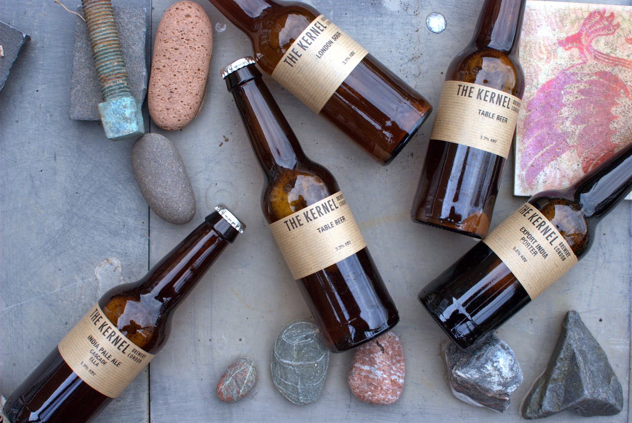
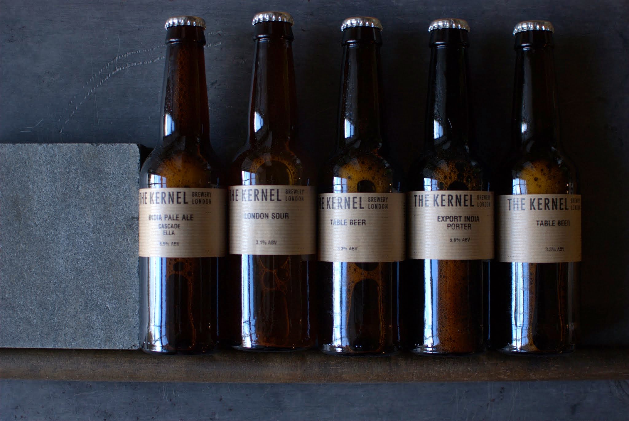
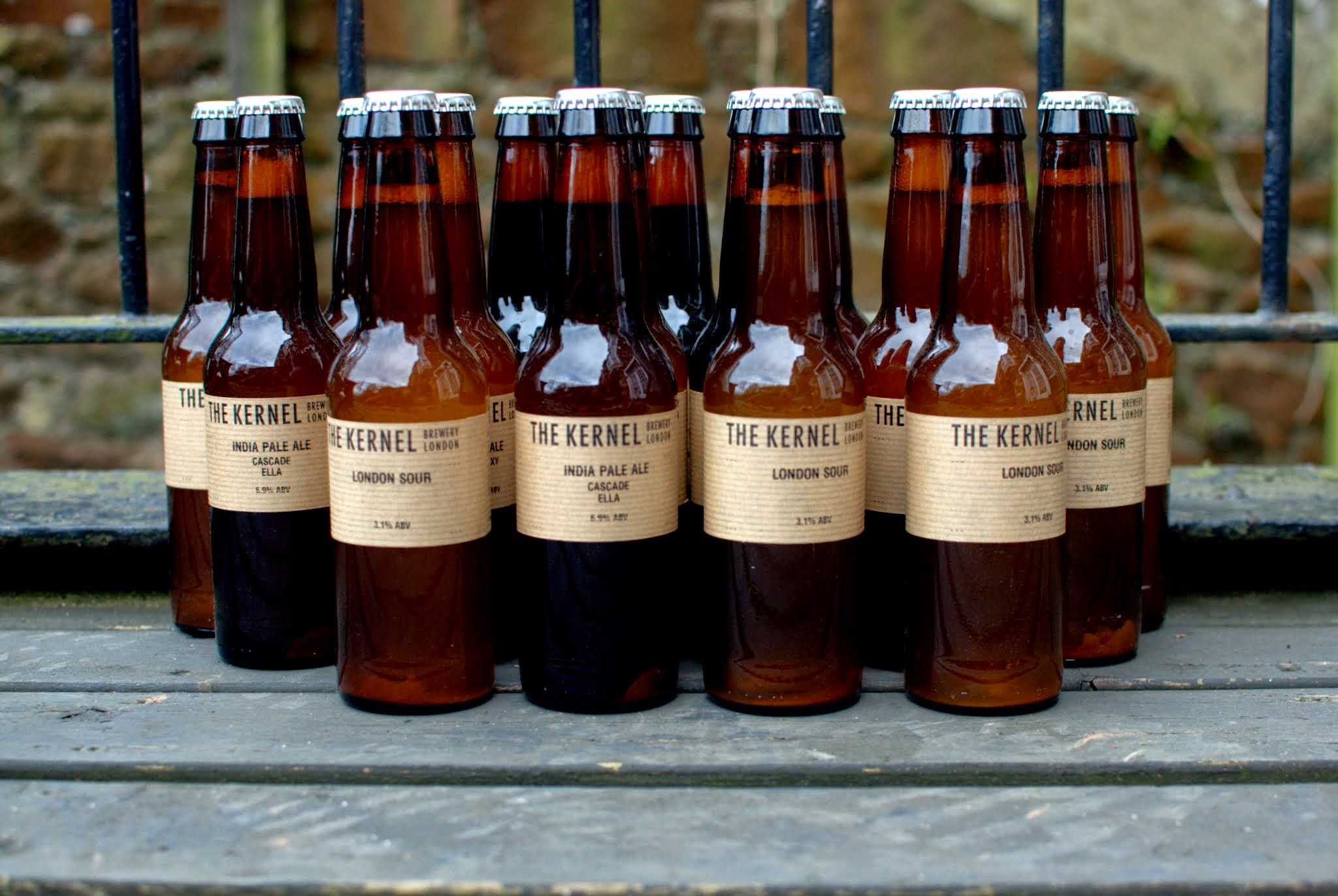
- Use the gallery option (skip to the beer) to arrange multiple images, don’t fight with the template and try getting a gallery look with loads of single images, it just won’t work. Connect JetPack for more fun things with galleries.
- As before stick to one aspect ratio and orientation or if you must mix and match, use the same aspect ratio.
- In the aside above I show how in Classic WordPress, you can get images to flow around text, a feature designed to help you create great simple layouts, but which seems to be ignored by many
- In the latest WordPress you can create great layouts with considerable flexibility using blocks and block patterns (such as the one below)
- Optimise the images for the web. Look out because there’s a lot of advice some of which may sound conflicting and depends on the publishing platform. But essentially 1200px is the absolute minimum. WordPress does some clever resizing, which can be useful.
- When you save your images always give them a decent name and perhaps date them (you may need to use them again so this makes finding them less stressful).
- When you upload them the filename should become the title. You will be also able to find it again in your WordPress; once in the media library an image can be used again and again – no need to re-upload. Moreover search engines will be able to find it, so enriching the web, which is largely full of badly described things. Use the ALT tag, the caption and the description copying over the title to save time. This makes it possible for screen readers to make the web more accessible for all users. Delete duplicates as soon as you spot them. Leaving it til later is not advised.
A thousand words leave not the same deep impression as does
Henrick Ibsen
a single deed
The block above is a simple image and text formatted as a quote
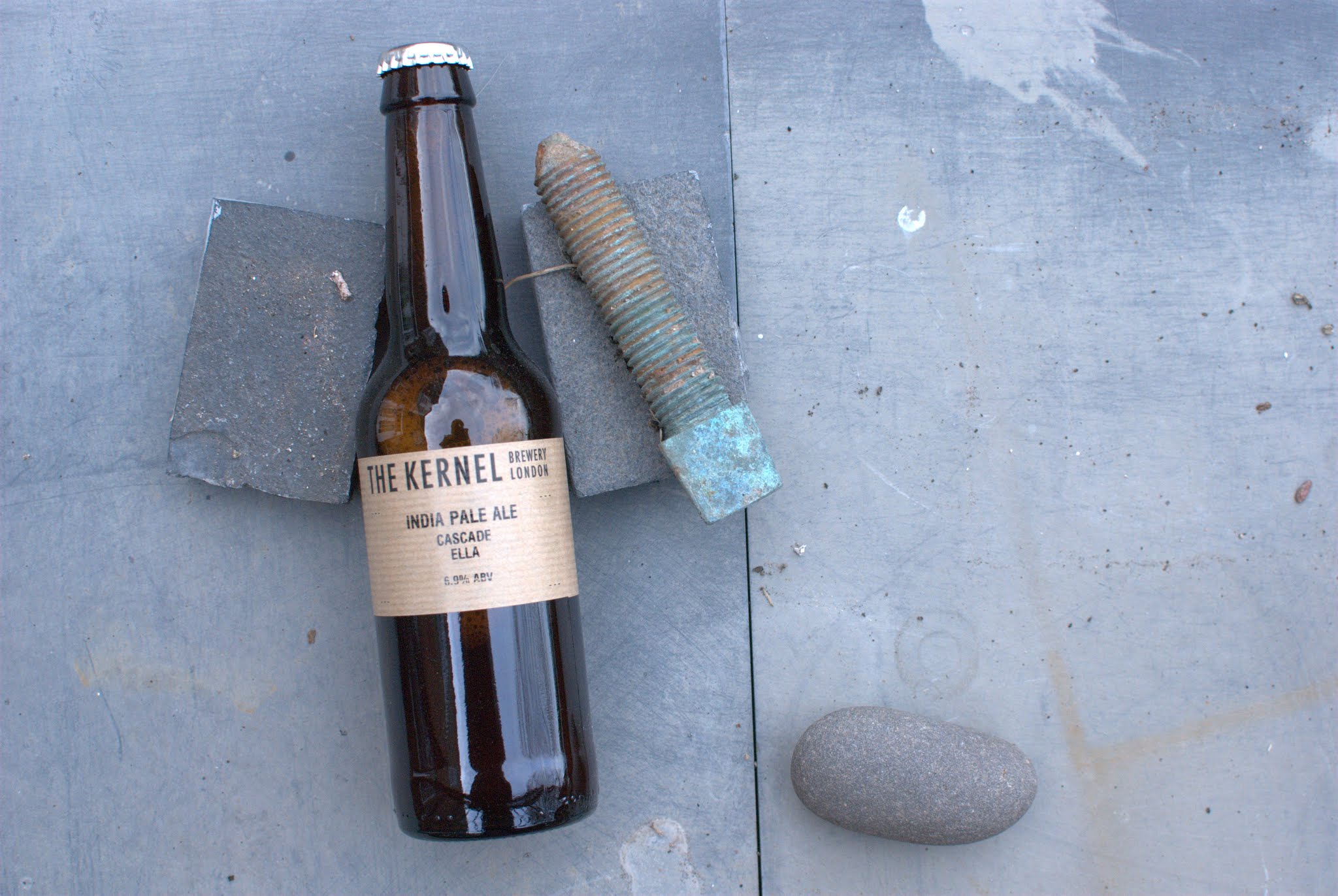
If you have got this far, reward yourself
If you have an ourlocality website and have a formatting question/s. which is/are making you tear your hair out, then ping us a message
ourlocality@sustainingdunbar.org