Block editing is reasonably simple. Just start typing at the prompt to get started. Hit return to start a new paragraph.
Formatting options appear on the RHS, where you can muck around with font size and employ the drop caps.
Each paragraph is a block. If editing a page created before enabling the Block Editor, the Classic Editor block will show.
Blocks are more than just paragraphs. They include the full array of page elements. As well as formatted text you can have headings, spacers, Read More links and obviously images, galleries and embeds too. But there is more.
In old fashioned WordPress, the template author had to do a fair amount of work to create a suitable site structure or a page layout/template. The template author would fix the main headings and menu positions, along with a sidebar and a footer. New page templates would be difficult if not impossible for ordinary users to create from scratch without prior coding knowledge or infinite patience.
With blocks, any old user can create a fairly good looking page layout, with only basic knowledge and no code. Some patience is required.
As long as the template employed permits it, you can escape the limitations of a basic page.
WordPress marginalia (known as widgets) can also become part of the page layout, but the block philosophy goes a bit further. Column layouts and other block features make page creation a bit more fun. Blocks are very useful if you are creating landing pages that need to show off something or just where you need a more complex layout, perhaps when designing a front page.
Here’s a few things you can do:-
This is a familiar heading
this is a quote
So Says Socrates
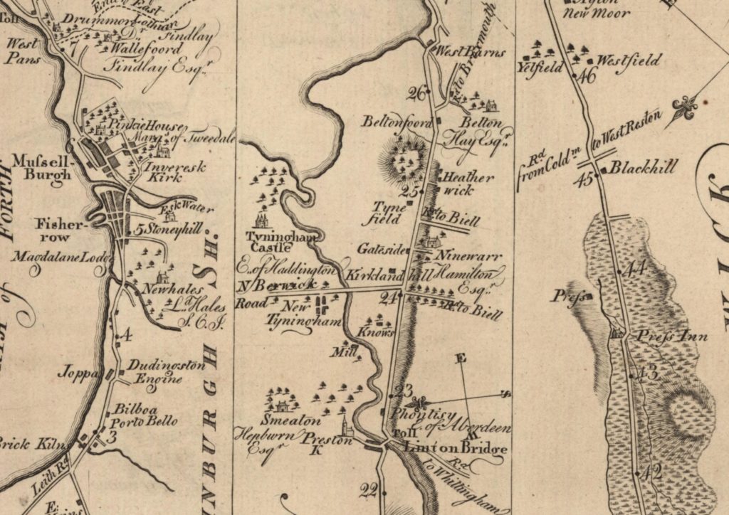
But checkout below the separator. This is a columnar layout with three images. All perfectly doable in old fashioned WordPress, if a little involved, but it becomes a breeze to arrange figures and text in predictable arrangements. You’ll know what I mean if you have ever tried to align three images horizontally. What is more, the layout should perform in a responsive way to the screen size of the device that you are using. In our case the images should stack nicely.
we can then write a little text below

we can write text below

we can then …
Moving stuff involves dragging and dropping, with additional controls to nudge a block up or down. This is handy as the new Block Editor sometimes refuses point blank to play nicely.
Below we have a cover image, which is usually a big bold image with some text flowing over it.
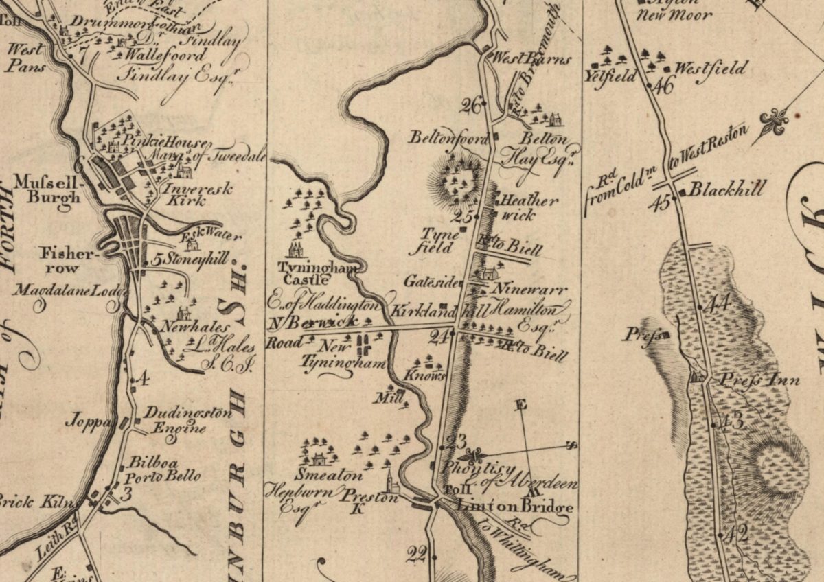
This is a cover block
The background is a linear map. Such maps are condensed maps for routing and focused on a main road.
And here is a bit of poetry to show off a new formatting option.
a word
or a line
or two of terse prose
is not really verse
Sometimes you need to have text beside the image, rather than have the text flow around it. Sometimes you need a range of different things
In the following we have created a “group” block. By grouping a number of block elements it becomes possible to re-use the layout, again and again. Groups can take a little longer to understand and implement and getting them right takes a little bit of trial and error. Widgets can’t be re-edited as flexibly either.
Handy I imagine for multiple sections ore for team member pages, marketing landing pages, project or portfolio pages.

Contact me if there is anything on this page that you want to discuss
And that is the end of the Group.
The Classic Editor block
 Classic editor is a single block without the faff of separate paragraphs.
It isn’t plain sailing though, as in my case the kitchen sink (the Classic Editor toolbar) disappears the moment I want to use it. I had to log in as a different user before it started working again.
And that in a nutshell is Gutenberg Blocks.