- Why not try Twenty Twenty Five early
Can’t wait for the old year to run its course? Enable Twenty Twenty Five now and start the new year with a complete refresh.
With a rag bag of new features and iconic ready made layouts and patterns, you can pair it with Twentig and import 4 completely different themes.
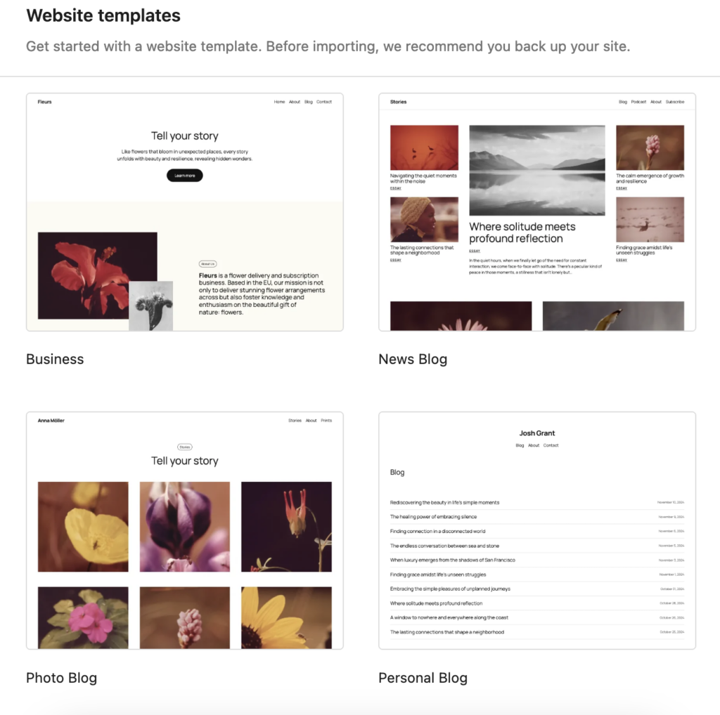
TT5, like all new WordPress templates since Twenty Twenty Two include the full site editing experience. If you don’t want the fuss of page template editing, stick with TT and TT1, which also pair beautifully with Twentig, our favourite template partner.
- Twenty Twenty Five a flexible design-focused theme
Introducing
Twenty Twenty Five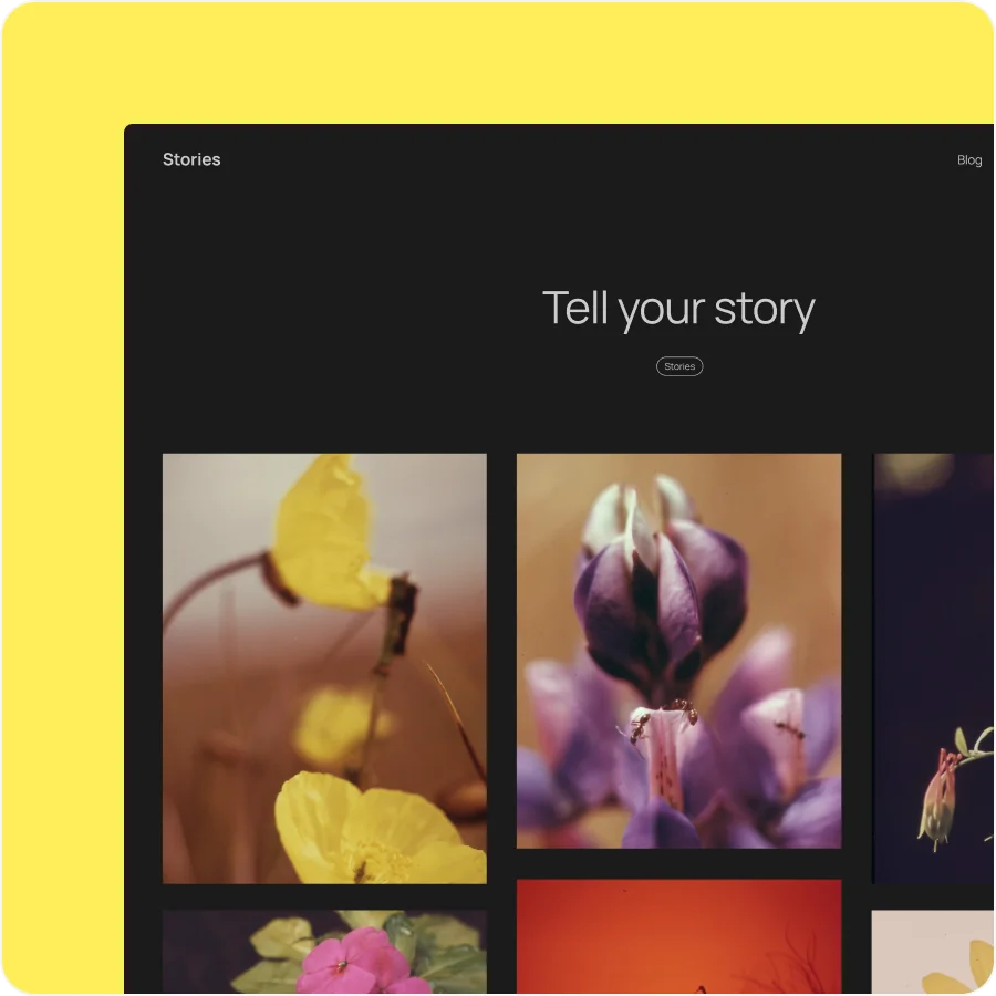
Endless possibility without complexity.
Twenty Twenty-Five offers a flexible, design-focused theme that lets you build stunning sites with ease. Tailor your aesthetic with an array of style options, block patterns, and color palettes. Pared down to the essentials, this is a theme that can truly grow with you.
Prefer to see 2025 in action?
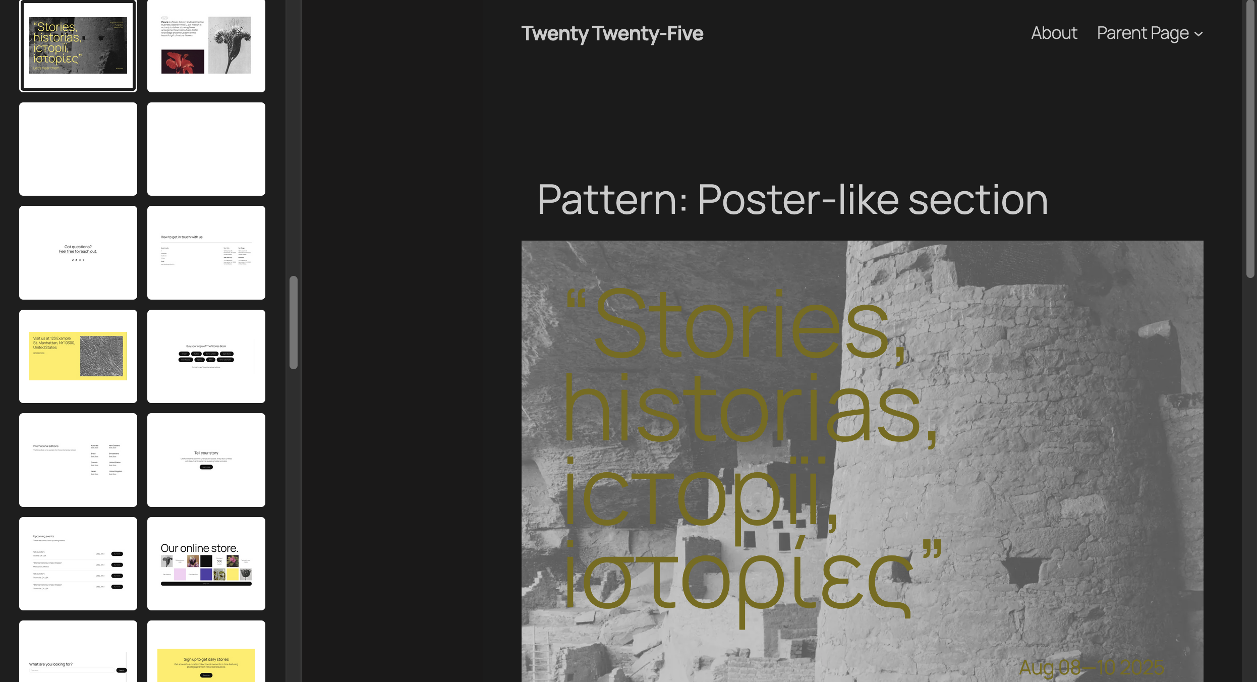
Get the big picture with Zoom Out
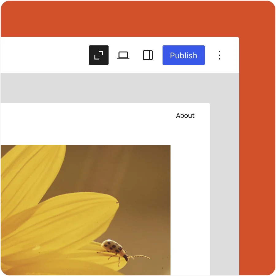
Explore your content from a new perspective.
Edit and arrange entire sections of your content like never before. A broader view of your site lets you add, edit, shuffle, or remove patterns to your liking. Embrace your inner architect.
Connect blocks and custom fields with no hassle (or code)
A streamlined way to create dynamic content.
This feature introduces a new UI for connecting blocks to custom fields, putting control of dynamic content directly in the editor. Link blocks with fields in just a few clicks, enhancing flexibility and efficiency when building. Your clients will love you, as if they didn’t already.
Embrace your inner font nerd
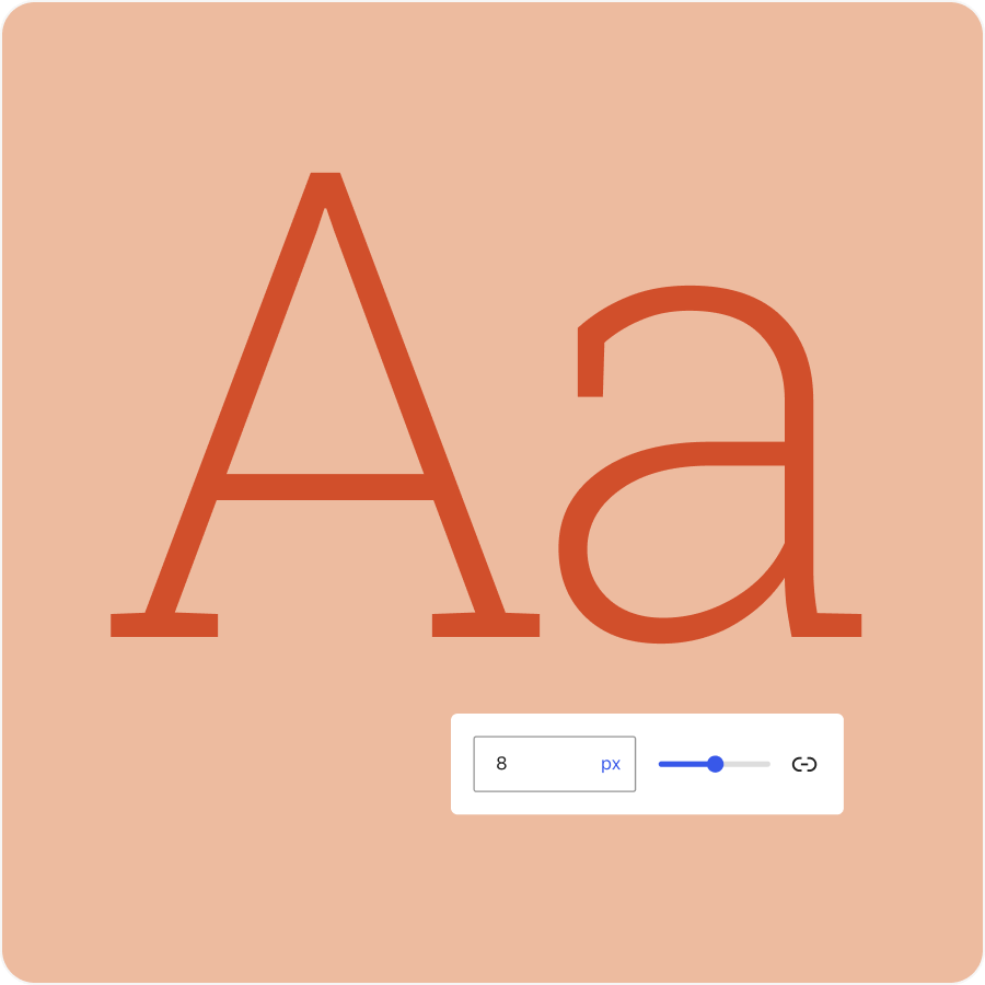
New style section, new possibilities.
Create, edit, remove, and apply font size presets with the next addition to the Styles interface. Override theme defaults or create your own custom font size, complete with fluid typography for responsive font scaling. Get into the details!

Performance
WordPress 6.7 delivers important performance updates, including faster pattern loading, optimized previews in the data views component, improved PHP 8+ support and removal of deprecated code, auto sizes for lazy-loaded images, and more efficient tag processing in the HTML API.

Accessibility
65+ accessibility fixes and enhancements focus on foundational aspects of the WordPress experience, from improving user interface components and keyboard navigation in the Editor, to an accessible heading on WordPress login screens and clearer labeling throughout.

And much more

Support for HEIC images
HEIC image support improves media management by allowing high-quality, space-efficient images across all blocks.

Streamlined Query Loop block
Improvements to the Query Loop block enhance usability by automating default settings and consolidating key options for easier customization.

Extend the preview dropdown
Enhancements to the Preview Options enable plugins and themes to add custom items to the dropdown menu, enriching how content is previewed.

Customize site background
Improved background tools enhance block customization and allow for global settings, ensuring consistency across the site while simplifying design efforts.

Refined pages view in site editor
Streamline editing with enhanced page views that offer customizable filtering options. Toggle filter displays to access refined views like Published and Drafts without clutter.

Template registration API
This new API simplifies custom template registration for plugins, allowing theme overrides and custom category templates for greater flexibility.


Expanded design tools
Support for design tools expands to more blocks, adding shadows, borders, and more, for greater customization.

Improved Interactivity API
Enhancements to the Interactivity API include bug fixes and new APIs for better state management.
- Creative Covers: How to
The modern website must have tools to create full screen covers. It is annoying to have to rely on a plugin to do this, which is where a modern WordPress template and WordPress blocks can make light work of the job.
To get started click the Blue Button in th new editor and start typing “co …” and then select Cover from the filtered list. (You will need to ensure you have the Block Editor enabled: You can enable blocks globally or selectively in Dashboard > Writing where you’ll find 2 options. Best to selectively allow users to switch.)
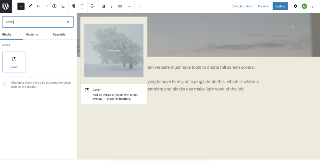
Covers have overlays, but you can override the defaults (centred) and set the opacity to 0% if you prefer.

Creative Block
under cover of darkness

content aligned bottom; cover width narrow; text size is normal; opacity 50% can help to emphasise text on a light background
Then select the align icon to choose Wide Width or Full Width.
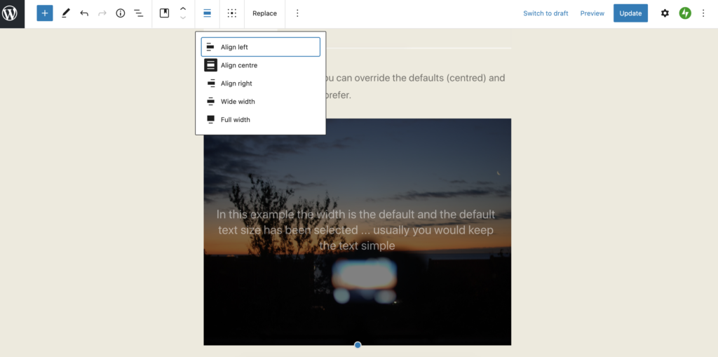
At this point you should check out the specific block options. These can be hidden from view until you click the black gear symbol top right hand corner.
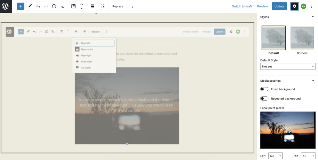
Effects like the fixed background can be engaging or just make your readers feel queasy. What can be useful is to alter the focal point of an image and nudge it over a little to the left or the right.
And that would normally be it, but you may be asking how did you remove the title entirely without leaving a blank space? Here’s how. In the Customiser > Css editor we remove the .entry-header div, but only for the specific post in our case #post-107, where 107 is the post id, which can be found easily by hovering over the article item in question. To list all your articles: Dashboard > Posts.
/* How to remove the title of a single post */ article#post-107 .entry-header { border-bottom: 0; padding-bottom: 0; margin-bottom: 0; visibility: hidden; height: 0px; } - Status
I am having a relationship with Kafka :-)
Status Updates are a little like Asides insofar as the title gets stripped out, which may suit you if you are prone to forgetting the subject line.
- A Quote
Language is but a poor translation.
― Franz Kafka - An Image
Just type /i into a new para will pop up the image block. Lots of framing options or go plain vanilla.

Eyemouth harbour - A Link
- A Gallery
This is an area which seems to trap unsuspecting first time users. Type /g to get the wizard up and read carefully. No need to add images twice, they can be used and reused again and again. Make sure you render the images at Large or Full size to avoid pixel scarcity. Add or remove pictures later.


And a gallery looks like this in this case using cropped images to create the impression that I care that it looks good! But there’s nothing to stop you adding further content below or above for context and elaboration.
- Image Management
Many website users struggle with images, even those that have managed a website for years. Here’s some straightforward things you can do to make your photo publishing weblife easier.
The image block is easy to use as is the gallery block. If you must combine text and images and want it to look the part use a pattern. Simply start a new para and /im will get the image block up.
In the world of classic editing creating anything complicated become quickly very hard. Now it is easy enough to take a ready made block pattern and adapt it to your needs. But most of time just using a featured image (as shown above) will do.
Avoid using classic unless you are desperate for the limited retro editing experience.
A lot of image problems start before the website interface.
Phone or digital camera?
Even the cheapest digital camera or phone will offer multiple formats for taking snaps. The smallest file size may well let you store and potentially share many more pics, but the smallest size will be inadequate for many publishing purposes. Too small and the snaps will look grainy when enlarged or zoomed in and disappoint in print. It is not realistic to improve or crop a small image (less than 800px wide might be a rule of thumb, but twice that is fine).
Full size or RAW images give greater flexibility, but you’ll need more space to store the originals and convert to jpeg before uploading. While they may be way too big for instant web publishing, a large image is valuable insofar as it will be zoomable, can be cropped harder, will render well in print too and may even be subjected to judicious photoshopping to alter a color cast.
You’ll also see that if you download an image from our WordPress often it is in the webp format a relatively new compression, but already in widespread use. Don’t worry you can open it in Photoshop!
Light
An image shot in poor light or using the phone’s digital zoom may not render well on your page. In poor light the sensor adjusts automatically and reduces the quality of the image, unless you use manual settings. You’ll notice pixellation effects on the large screen, even without looking too closely, that were not perhaps so obvious on the phone. But if you are taking arty shots, poor light can be exploited to add dramatic effect – e.g. a lens flare or moody dark sky or pixellation for that retro early digital look.
If you use the camera’s digital zoom, you will lose detail in much the same way, avoid it – get closer get a proper camera.
Frame
Frame your pics appropriately for your website. Landscape orientation is the best all round solution, but it depends a little on what you are aiming to do. Mugshots of the team might be better shot portrait or rendered round or square. Check too whether the snaps are in a strange aspect ratio (e.g. many phones use 20:9. For that long letterbox video look that is great on your home widescreen, but may not work so well for basic pictures).
Stick to 4:3 or 3:2 for your project. The 16:9 video format is also OK for images, but in landscape. Use it in portrait only if you want to look like the cool kid on the block. Be consistent don’t mix and match ratios and orientations, as most of the time it’ll not look good and makes it harder for you to assemble multiple images in a gallery, unless the gallery magically re-crops everything. There are no hard an fast rules, and rules are for breaking – but you have to be good to break them elegantly.
Size
Some applications let you save for web publishing. But what if you just have an image someone sent you? The rules are not hard and fast, but a “featured image” (this is the one at the top of you post/page built in to the template) should be at very least 1200px wide. I would err on the safe side and go for 1800px or more. Invest in a package to help you manage the processing steps, and remember to respect the cropping options – don’t try and do it by eye. WordPress also creates the intermediate sizes for you, so you don’t have to waste time creating thumbnails. If someone sends you an official photograph and it is too small or just wrong, ask them to resend and if they have it the the original. It is your website.
One picture or 2?
A picture is worth a thousand words, or so goes the saying, but too many might dilute your message and increase the time it takes to optimise and process, name and display and load a page for the unsuspecting user at the end of a PAYG phone (like me). Select the images with care and attention to what you are trying to say. Don’t dump them on the server, it is not a good place to store your life (but neither are social media platforms).
Aside
This aside uses a classic block.
 In classic WordPress the image can be positioned relative to the text right or left or above it. The default, strangely, always gives unsatisfactory results, yet few realise that they can fix this. If practice the old way is a bit fiddly when manipulating multiple images (impossible to reliably lay out rows and columns) but can be useful as you can get the text to flow around an object like this without thinking about layout. The trick is to keep layouts simple. The latest WordPress is obsessed with layout and the options are by contrast almost as baffling as they are wide.
How to look good
- If your template supports it always use a featured image option – it will display as the template author intended and moreover news feeds, social media and search tools like Android’s Discover will be able to find it
- If you do not use the featured image some feeds will grab the first image found, so make sure that that the first one is suitable and gives the right message
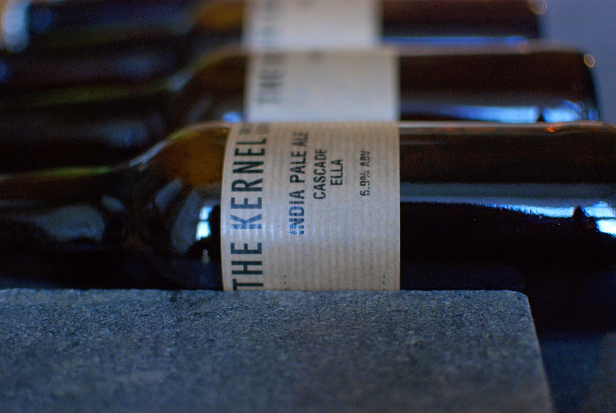
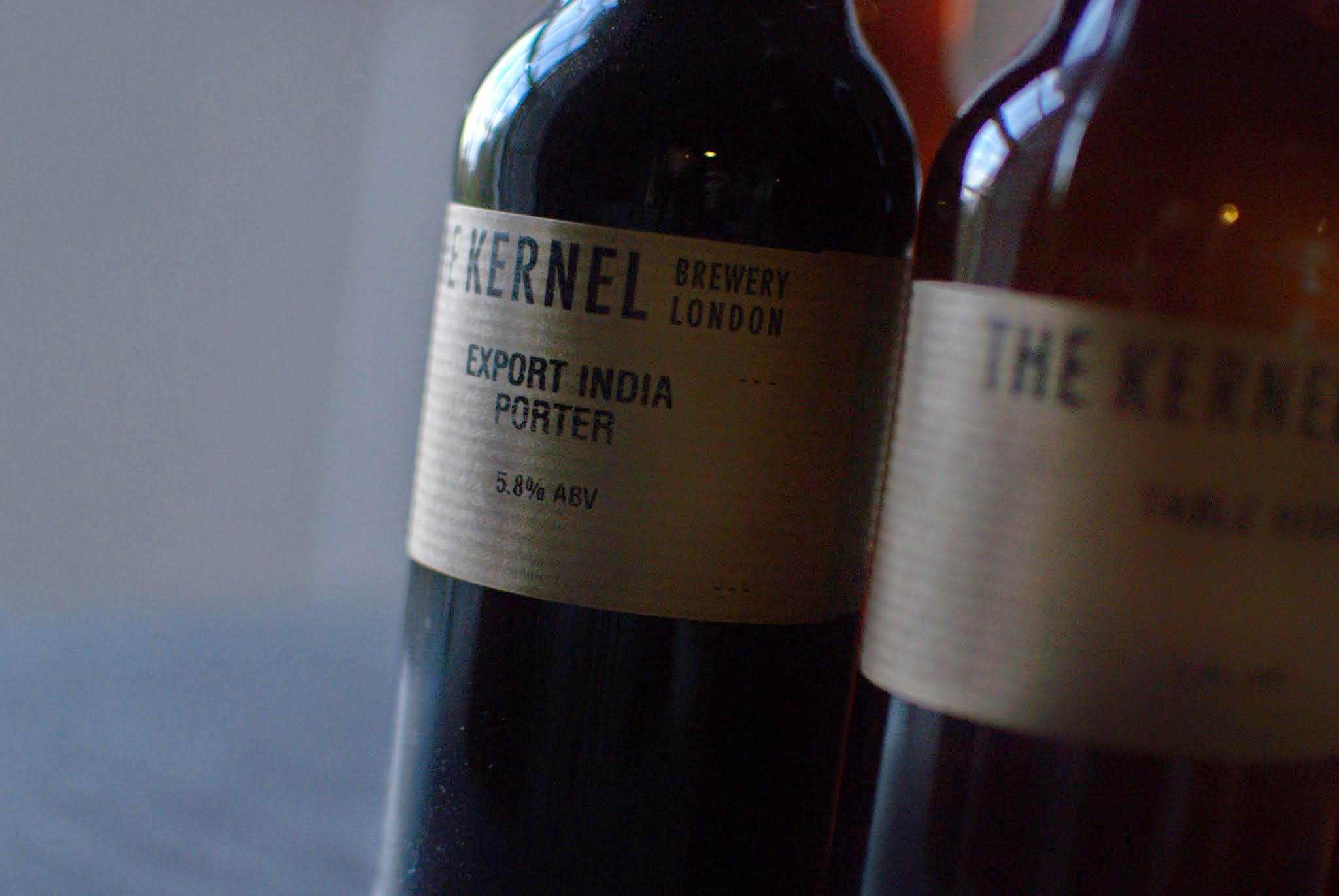
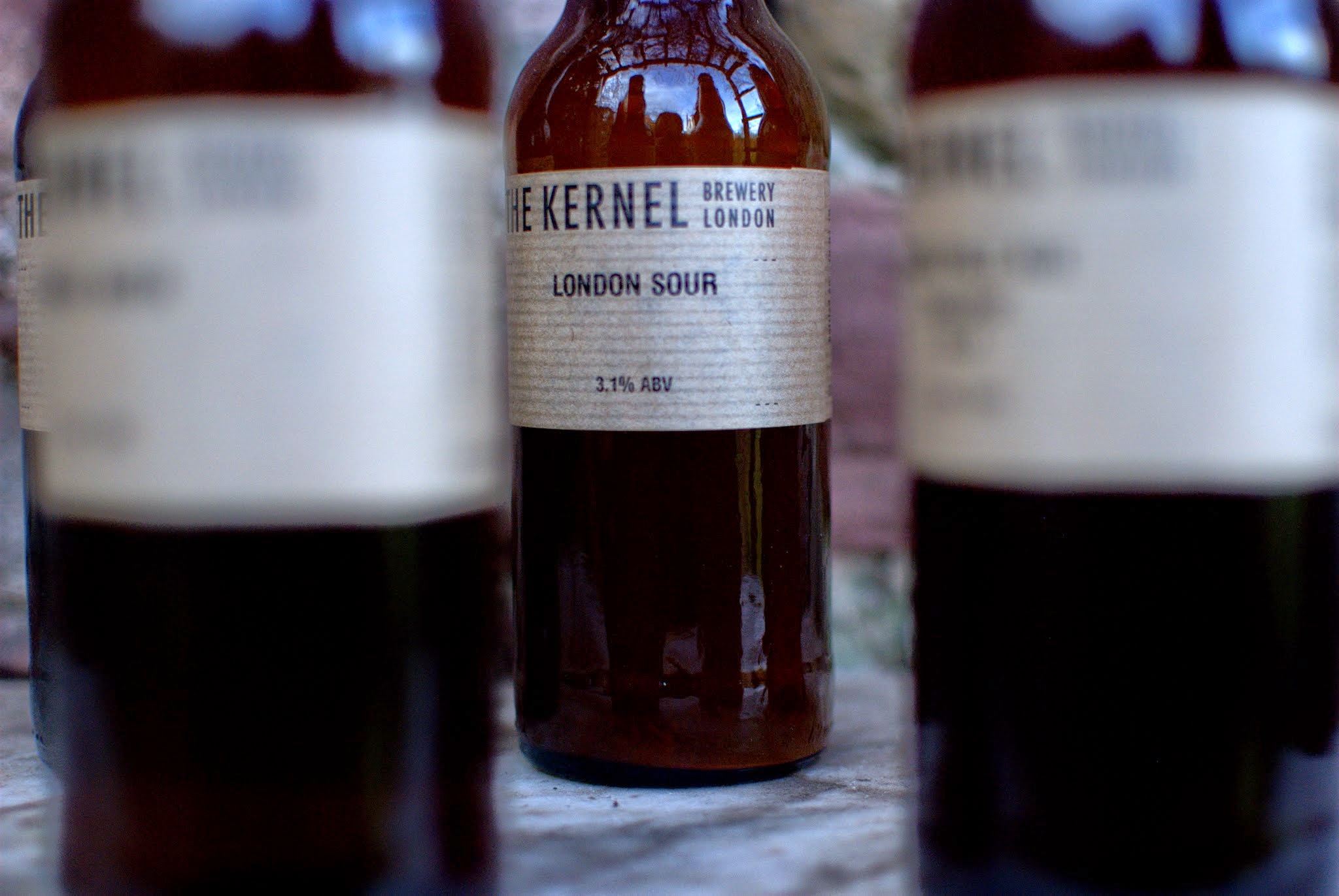
- Use the gallery option (skip to the beer) to arrange multiple images, don’t fight with the template and try getting a gallery look with loads of single images, it just won’t work. Connect JetPack for more fun things with galleries.
- As before stick to one aspect ratio and orientation or if you must mix and match, use the same aspect ratio.
- In the aside above I show how in Classic WordPress, you can get images to flow around text, a feature designed to help you create great simple layouts, but which seems to be ignored by many
- In the latest WordPress you can create great layouts with considerable flexibility using blocks and block patterns (such as the one below)
- Optimise the images for the web. Look out because there’s a lot of advice some of which may sound conflicting and depends on the publishing platform. But essentially 1200px is the absolute minimum. WordPress does some clever resizing, which can be useful.
- When you save your images always give them a decent name and perhaps date them (you may need to use them again so this makes finding them less stressful).
- When you upload them the filename should become the title. You will be also able to find it again in your WordPress; once in the media library an image can be used again and again – no need to re-upload. Moreover search engines will be able to find it, so enriching the web, which is largely full of badly described things. Use the ALT tag, the caption and the description copying over the title to save time. This makes it possible for screen readers to make the web more accessible for all users. Delete duplicates as soon as you spot them. Leaving it til later is not advised.

A thousand words leave not the same deep impression as does
Henrick Ibsen
a single deedThe block above is a simple image and text formatted as a quote
If you have got this far, reward yourself
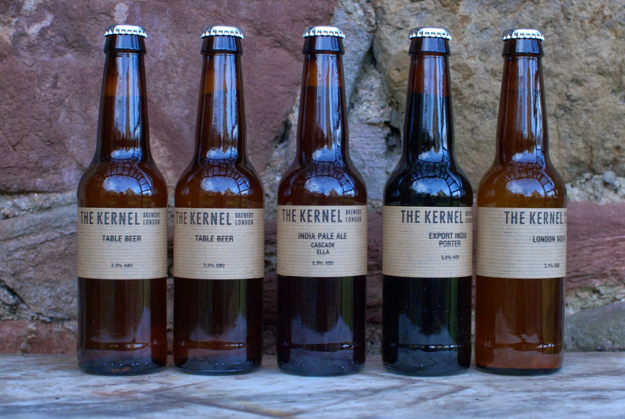
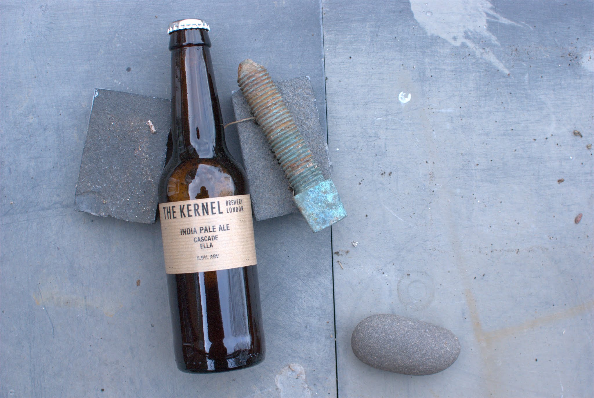
If you have an ourlocality website and have a formatting question/s. which is/are making you tear your hair out, then ping us a message
ourlocality@sustainingdunbar.org
- Help Switching
Inertia prevents many people from switching. Switching their bank, energy supplier, or their insurance provider. The idea that there is a better deal out there might sound appealing on one level, until you actually have to feel the pain of doing it. So many don’t. Regulators and economists seem to overlook this.
It is much the same with website templates (and website technologies). Many users stick with what they know … perhaps long after their template has been abandoned, demonstrably no longer working by modern standards (e.g. looks dreadful on a phone), or worse throws up ugly errors.
However, switching templates, like switching bank, is a faff, especially if website management isn’t part of the daytime job. Experience suggests many will postpone indefinitely until something breaks or worse they find their website has been taken over/defaced. It happens to the best people. But if you are using an older template (more than 5 years old or not received updates in 2 years) and you value your digital presence / reputation, you’d be wise to consider a switch.
If you having been thinking of embarking on a change, but have procrastinated, why not reach out. We’ll happily give you some free advice and perhaps lend a helping hand, as it is after all the season of goodwill – meaning that there is still snow on the ground.
- What’s new in 2021?
Twenty Twenty One (TTO from now on) is the default WordPress theme and looks plain and old fashioned, but tailored around the new Block Editor.
First off there’s a selection of default colours that are designed with Dark Mode support in mind. So will suit blog posters whose audience is nocturnal.
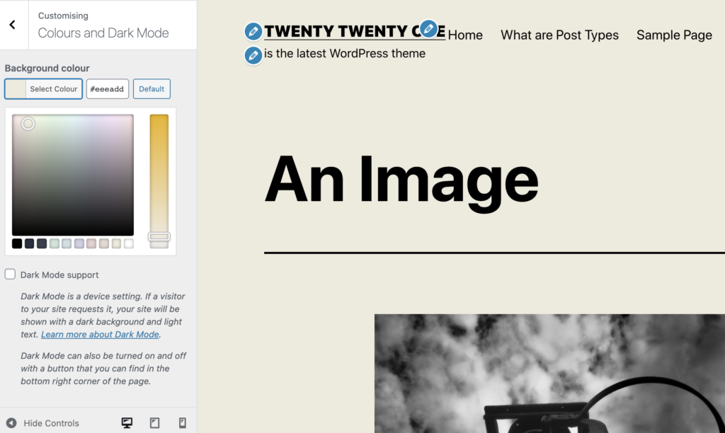
There’s an interesting muted pastels palette to try out 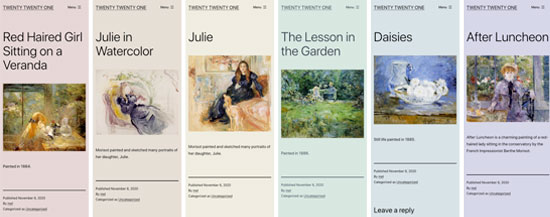
Or you can spend hours trying to get a better palette yourself Starter Content is available in a brand new TTO website. Clicking on the Publish button in the Customiser will automatically generate a basic website structure for TTO, which can help visualise your brand new site.
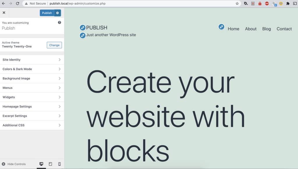
Starter Content only available on a brand spanking new install There are a ragbag of attractive additions to the Block Editor too. But if you are stuck or wedded to Classic Mode still, you won’t be able to enjoy these until you switch over. You can also switch pages and posts selectively, if you are still trying things out.
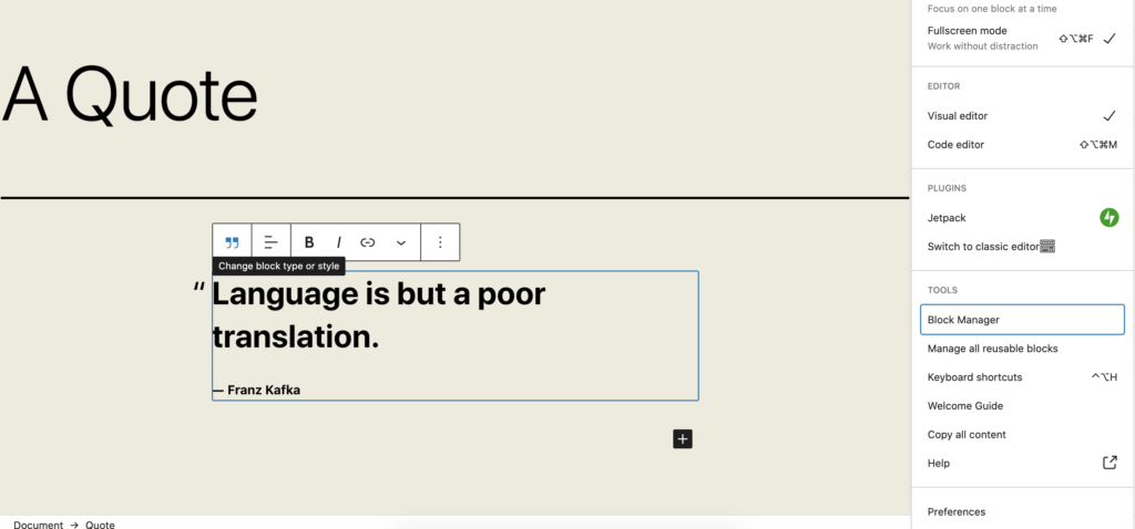
There are a host of options for simplifying your blocky life. You can reduce the number of blocks you see or check ones that you don’t see inside the Block Manager. Additionally in preferences you can simplify the screen:
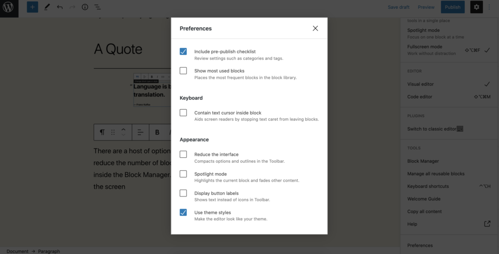
Nota Bene Decluttering can be taken several steps further by enabling Spotlight mode (greys out the other blocks subtly) and Full Screen modes (removes the familiar WordPress sidebar) and, my favourite, which is to move the Block Edit options to the top of the page, where they are far less instrusive and less likely to pop up at random.
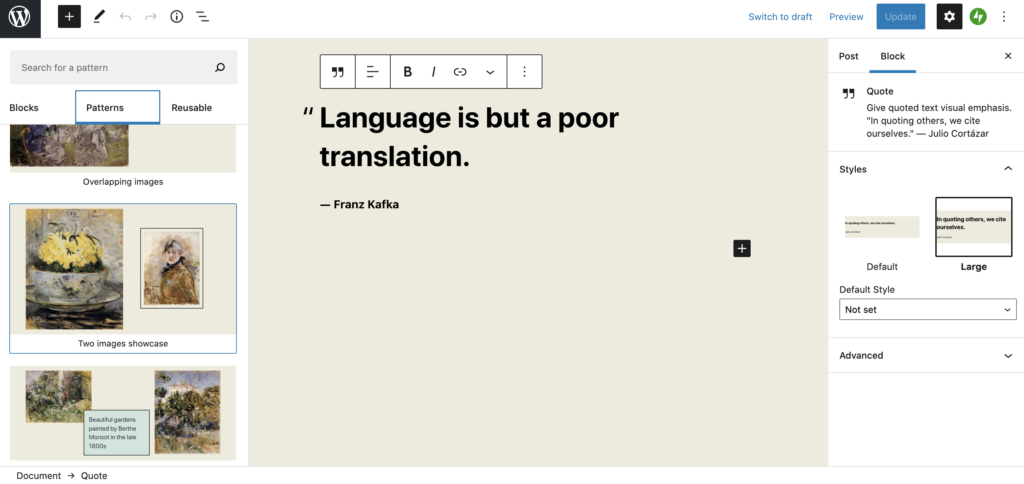
Then there are a panoply of “Pattern” suggestions to layout your page, which to my mind are decidedly retro (and therefore rather fashionable, like dried flowers). However if you like the idea of content overlapping and breaking the rigidity of the traditional website grid, then you’ll enjoy TTO. To see all the available Patterns, click the big blue + sign in the top left or when you first insert a block with the mini black +, select Browse All.
And finally, if you are making a page with a number of pages that need to respect a standardised layout, create Re-usable Blocks:
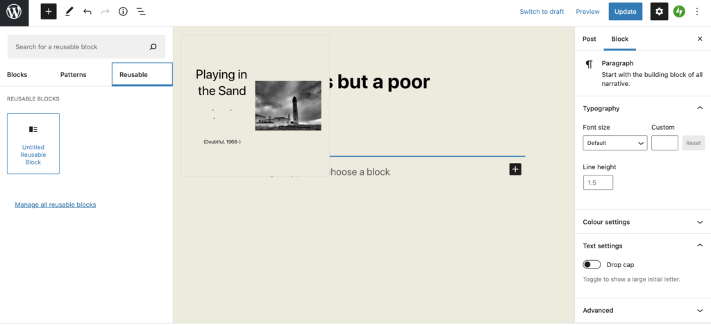
And then convert to a regular block to open up the full editing options:
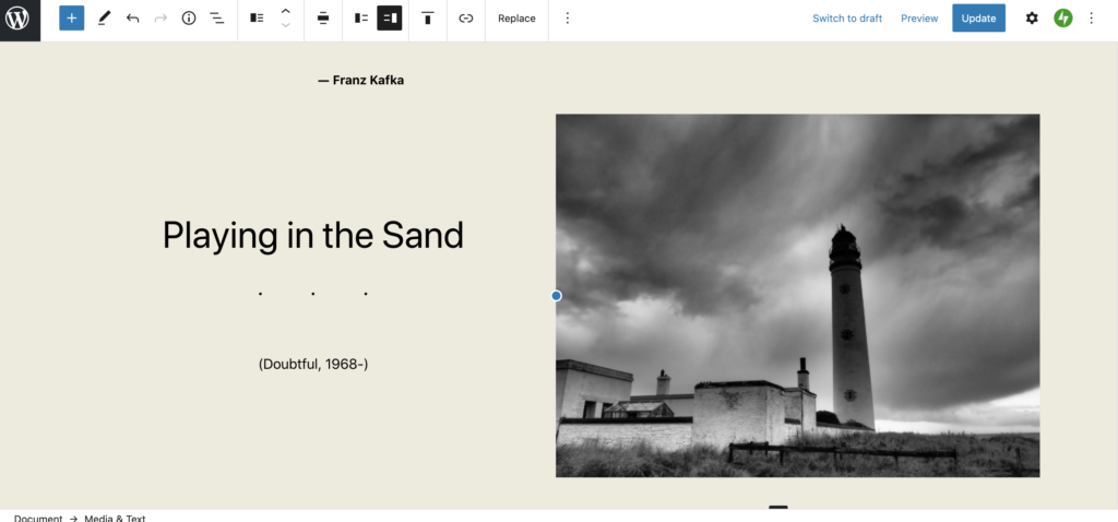
More about TTO here:
And that is it from “a blog a day” …
- Video
The video block is as easy as popping a youtube or vimeo link into your page
- Chat
It seems I cannot chat with Kafka :-(
- Hello Twenty Twenty One!
Prematurely, Twenty Twenty One is here!!! It is the new WordPress theme and, naturally, supports WordPress Blocks (since Twenty Nineteen most WP themes should). Once you get the hang of Layout Editing with blocks, you should find they are great, especially for designing bespoke pages which need to look properly laid out. It is also quite easy to make your page look bad too, so keep your block layouts as simple as possible – this page you are reading is a good example of poor layout.
Suffice to say you will need some time on your hands to get to grips with blocks or someone who knows the ropes. Feel free to reach out for assistance if you have the urge to activate blocks.
To get started go to the writing settings and tune your Writing Defaults
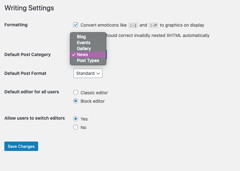
You can also set the default category or the default post format, e.g. if you want to post brief social media like updates, switch to Asides or Status as the default.
Another trick enabled by the new editor is that you can clip a part of your screen and post it straight into your edit window.
Here’s what the WP folk say about Twenty Twenty One …
Twenty Twenty-One is a blank canvas for your ideas, and it makes the block editor your best brush. With new block patterns, which allow you to create a beautiful layout in a matter of seconds, this theme’s soft colours and eye-catching – yet timeless – design will let your work shine. Take it for a spin! See how Twenty Twenty-One elevates your portfolio, business website, or personal blog.
From the Template Blurb
overlapping blocks? 

whatever next? You can do some pretty weird stuff with block patterns, but remember not to do this without a parent in the room!
Time for a quick plug?
You can get a free website in a matter of seconds and be publishing in minutes, no matter what your plan, aim, objective, goal or strategy. You don’t need one these days as you can make it all up as you go along.
so says @ourlocalityAND THAT IS IT FOLKS
- Switch your front page to any other page and enable a posts page
In the default WordPress setup the front page is set to a preset list of posts. Depending on the template you may get a grid of articles, a simple list or an embellished list, with featured images.
Some people prefer a static page to a list of posts as this offers greater layout options – perhaps a welcoming message. But you can still add a list of posts on the static page.
The default posts page remains a handy fallback as it gives access to the entire archive of posts. So before you switch your front page to a static page we’re going to enable a new posts page. Here’s how:
- Create a blank page and give it a sensible name like News, or Blog or All Posts. Don’t write anything in it, or a note to self to remind you (or your colleagues) not to edit that page! There should be a note from WordPress too.
2. Now in Settings > Reading reassign your front page to the static page you have just created and point your posts page to the blank posts page just created.
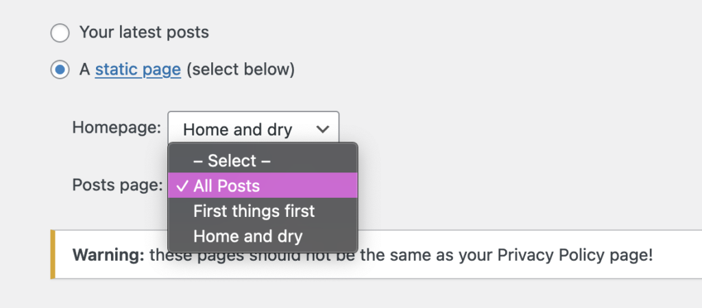
The posts page doesn’t have to be prominent or even in your main menu, but it makes sense to learn how to access it as it will have the authoritative and complete paginated list of all your post content.
Rookie errors
- To fail to assign the front page at all – the user gets a blank front page
- To create a static website and add news manually to the front page or add new pages when something newsy happens
- Create a new page or post (and the differences) and where it will appear
To create a page or a post you will need to be logged in – if you can see the black bar at the top of the screen you are logged in. From there choose New > Page.
A static page has a title and an area for the content. You can configure various Page settings, such as the date, the visibility and lots more from the right hand panel.
Note too that you can arrange pages in a hierarchy (perhaps by section or by theme). This is very helpful to reorganise larger numbers of pages into subsections. Use the quick edit option to speed things up.

Quick edit is highlighted A featured image is also advisable. Most templates support the featured image today, but not all will have more than one page or post template. Page and post templates are handy variations of the page layout that may be useful in different settings – e.g. you want to create a landing page or front page.
Add a paragraph and then add text In the content area. Here almost anything goes images, columns, tables, galleries, links to other trusted websites, video etc. Also you can trim a post with a Read More style link.
Some config options are in the block tab, in the right hand panel. The paragraph block has only a few simple settings. Others are more complex. Additional block management options – centering, linking and common formatting appear in a locked panel above the content or sometimes floating next to the block – we like it locked (see below):
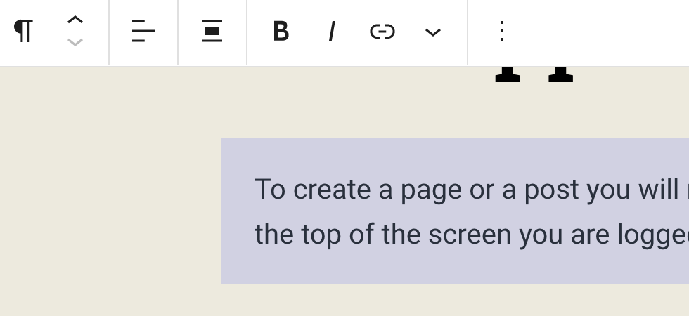
The floating formatting buttons can be locked 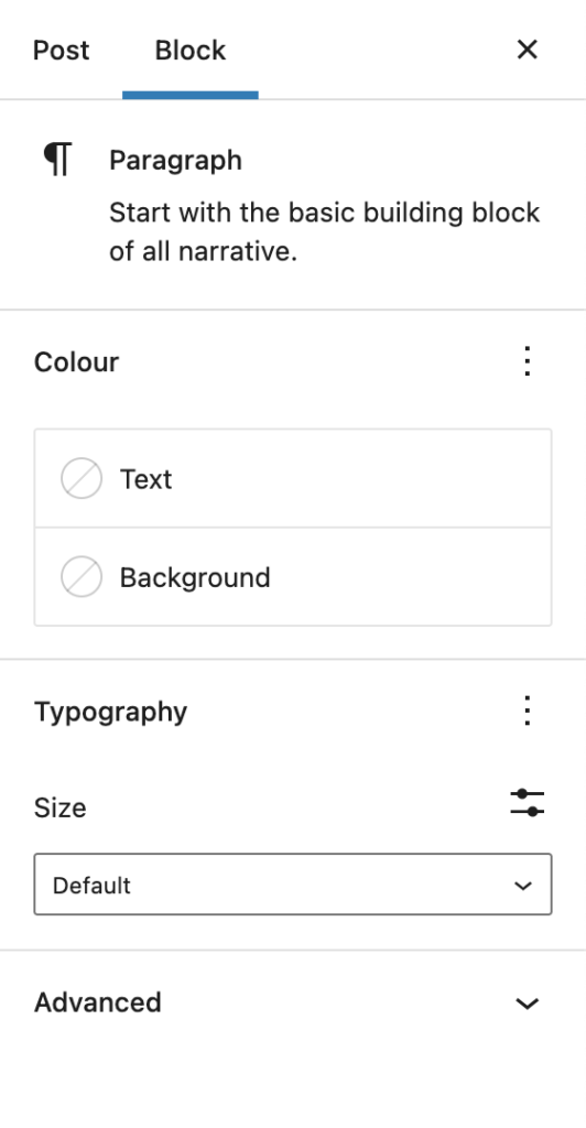
Block options on the RHS Posts are pretty much the same, but unlike pages you do need to categorise posts to make best use of the built in classification tools. If you want to link to or create menus relating to a topic all of this needs a little bit of thought. If you don’t have a taxonomy at the kick off and you post regularly, then one will emerge as you start publishing your news, blog or whatever. Hash tags are not compulsory but can help to link to similar articles if you have a regular blog covering a range of topics. Hash tags are designed to help the reader find similar articles. If you fill them up for the sake of it, you will have an index (which you can show off in a word cloud), but it may be more confusing than helpful.
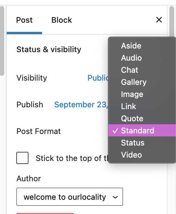
If you are using your your blog as a social media style stream (short posts, clips and links) you can also use a range of post formats.
Posts and pages feature the ability to schedule publication, or even publish in the past (especially handy if you are copying from a previous website and want to preserve the chronology, or re-create a diary or fake or just hide an update the past.)
But where do posts and pages appear? Posts and the posts page are dealt with in this article.
As for pages, in a typical default template (pre 6.0 and pre full site editing) you could get top level pages to magically appear in the menu or create the page stubs from the customizer. In reality these functions only help at the very early stages of a website development project, perhaps when sketching out the broa contours of your site.
It is more likely that you will want to arrange the menu in a bespoke fashion, perhaps hierarchically as drop downs. This doesn’t require you to arrange the pages themselves hierarchically, but it may help to follow the same arrangement.
Rookie errors:-
- Creating a static News page and constantly re-editing the static page, perhaps even deleting the old news
- Creating a new page for each article, perhaps in advance and then laboriously linking that into a menu or manually created list of articles
- Investing hundreds of hours making a brand new site which looks great, but never updating the news so it looks like you’ve abandoned it
FOOTNOTE:
Pages are ordered alphabetically in the back end, but you can force the order by adding a positional number or weight. We like to leave spaces so if you start with 3 pages you would assign the weights as follows 10, 20 and 30, with 30 the heaviest and it will sink to the bottom of the list. When you add further pages you can assign the weights above, below and in between. This is useful if you have a small manual to publish, or perhaps want to create a structured sitemap of all your pages. - Make the placeholder content draft
While you can easily delete the placeholder content, you can also make it draft – to refer to later.
Rather than deal with each post separately – you can do a bulk edit.
Select the items to edit, select edit, click apply and then change the status to draft. Hit update and you are done.
Bulk editing comes into its own when you have a large number of articles or pages to reassign somae attribute or another – e.g. change the author, recategorise everything, or make the content private.
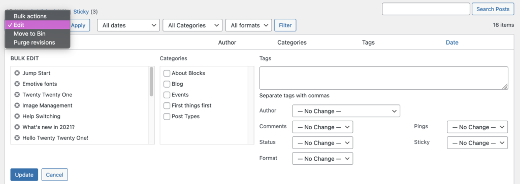
Rookie errors:
- To launch your website with the placeholder content still in place (actually we have seen this on websites selling professional website services!)
- To edit the placeholder content and forget to change some of the key information (title, date, category, url)
- Jump Start
To jump start your website, just start writing. Your website is hidden from search engines at startup, so you are safe to experiment away. No one will see your edits until you make it live.
Even if you are intent on making a single page website, you may need to work out how to:
The sky is the limit
- Emotive fonts
Choosing the right font for the job is pretty easy, scroll down the font list in your customizer until you find the one you like, no?
Even professional designers in a hurry might do this, e.g. if doing a quick favour or job for next to no money or they know the client is doesn’t know any better.
But there are many considerations that can improve your choice.
Choosing type is an resource over at https://fonts.google.com/ which is worth more than a quick skim through, covering the range of factors that might influence a more considered choice.
It starts with some easy ideas, such as emotional response and trust.
The infographic above combines fonts and adjectives that each type connotes.
Much berated, Comic Sans is perfect in many contexts, for a kids poster, an unpretentious note such as a shopping list and actually can work pretty well in comic too. But as the author of the article suggests, announcing scientific breakthroughs or anything too serious may not be appropriate, unless you do it with tongue firmly in cheek. A narrow range of brands or logos would work with Comic Sans, possibly.
But the question is, if your template only comes with 2 typography options, how do you add another font? Well you can use a number of so-called web safe fonts, but the number of web safe fonts is somewhat restricted, in part because they are operating system dependent. So it might not work on someone else’s computer or if they are using a mobile device.
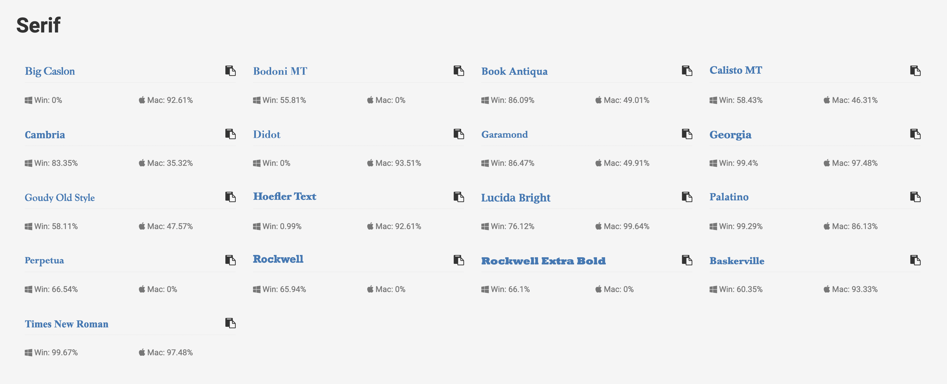
Click through to see the full list of Sans Serif, Serif and Monospace Because the web has developed along open standards, hacks are required to ensure that what typeface you see is what the author intended you to see.
activate the Google plugin.
Advanced users can also add a bit of code to their customizer settings and selectively.
In our example we created a Cover Block with a friendly bold font to announce we have a Creative block!
To do this, we went the advanced section of the Block holding the text “Creative block” and added a new style class: creative-block.
We targeted the class in the Customizer, making sure to add in first the @import statement.
@import url('https://fonts.googleapis.com/css2?family=Lobster&display=swap');

.creative-block {
	font-family: Lobster, sans-serif;
}
To change the fonts globally needs a little more care, as additional instructions may be needed and a little trial and error required to get everything covered as you would like iy. In the following example, we’ve decided that the rigid serif font is a little harsh and clinical for the long form paragraph text and we’ve switched to a traditional serif font.
@import url('https://fonts.googleapis.com/css2?family=EB+Garamond&family=Lobster&display=swap');

p {
	font-family: 'EB Garamond', serif;
	font-size: x-large;
}
There is a reason why the template designer selected 2 fonts. It just works.
- Twenty Twenty One
Is our new default theme, i.e. when you fire up a new site.
By all means upgrade to Twenty Twenty Two, if that feels right for you or you fear being left out of the full site editing experience, but we’re old fashioned and prefer the old world editing experience and the traditional customizer – with blocks and block patterns thrown in. In other words the best of the old and the new.
If you have just created a brand new site, don’t edit these pages – delete them instead and start afresh – or spend a little time familiarising yourself with what is possible, the different post types, and examples of block arrangements or layouts and then delete them.
If you hit a problem just ping us an email:
ourlocality@sustainingdunbar.org
- Before you make your site live (no one will find you unless they have the link otherwise) …
In our setup the default is to discourage search engines. This is to protect you from accidentally publishing your experimental doodles. In our experience many site owners can take many weeks, months, sometimes years to begin work and then finish their site.
For your sanity we recommend you make sure you visit the settings page Dashboard > Settings > Reading and scroll to the bottom, where you will see the options available.
Whilst it is up to the discretion of search engines to respect the discourage notice, the main ones do. If they find your page they will display a notice that robots.txt has denied them access. If your site has mission critical information that must not be made public i.e. is embargoed you should tighten the options to the users of the website only or to admins only.
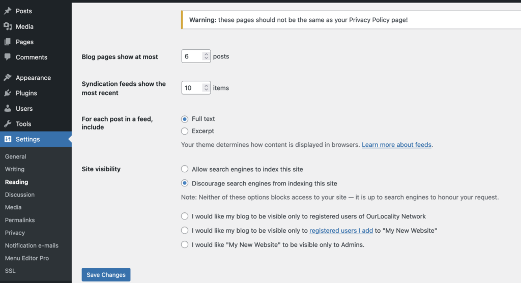
Once your site is live – search engines will start to add pages to the index Rookie errors:-
- Coming soon pages that never come anytime soon – good idea if part of a concerted plan to go live and you need to build a bit of momentum, collect email addresses etc
- Under construction pages – this is very 1990s – the modern website allows you to make everything draft – better not to publish at all or the search engine will remember your old content for much longer than is ever desirable
- Forgetting to change the discourage search engines notice for months and months thereby letting the search engine forget about you entirely …
- Forgetting to delete the placeholder content … images, pages and posts will be viewable and confuse your audience
- Add a widget in the footer or delete it
Widgets are blocks that appear outside the content area or a page or post. They include sidebars and footers and in some templates may include multiple positions in the header and above or below it.
Footers are useful for boring but essential items like a reminder of the legals, privacy, poilcies, social links, basically the who the hell you are guff, how to get in touch and your address if it is relevant (if you are a trading body, incorporated as a business or charity this is essential). In some websites they will contain a so called call to action, to sign up to a newsletter or join or donate. They are powerful because they appear on all pages including post pages, so important stuff doesn’t have to be repeated.
As with menus, there is a freestanding view which we have re-enabled as this has been withdrawn in recent updates an a customizer view. In the latter you just click on the desired element and it will appear below in the selected position (the footer in the example).
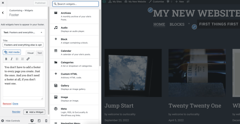
The customizer widget view To move elements around you simply drag and drop them. In the customizer remember to Publish your changes. In the non preview mode remember to click Done or Save, as appropriate.
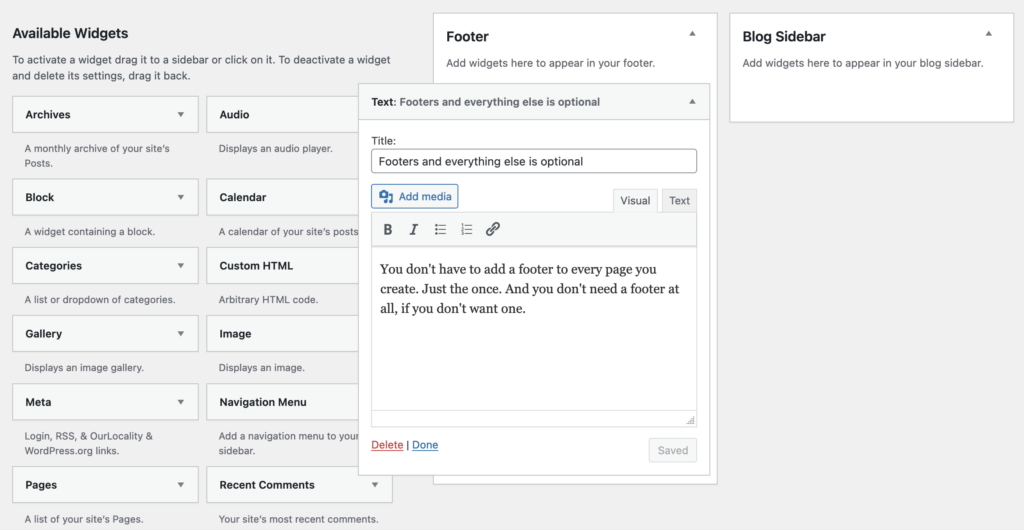
Manage widgets without preview Rookie errors:-
- Adding the same footer content to the bottom of your page or post, when you can do the very same thing with the footer widget once
- Using the backspace to go back to the previous page – annoyingly you will lose your edits!
- Leaving default widgets on your website with the placeholder content possibly advertising someone else’s creative business
- Cluttering the section with too much guff
- Adjust the menus or remove them entirely
Managing menus is fairly easy, but there are pitfalls due to the flexibility of the options available. You manage menus first by creating a collection or friendly handle/name for your menu. You may want to have a number of menus which you can swap around, perhaps you are doing a major revision to your site. In this case, create a new menu and work on it before you assign it an then publish it.
You can manage menus by selecting either the customizer option, the Menus option from the dropdown or Dashboard > Appearance > Menus.
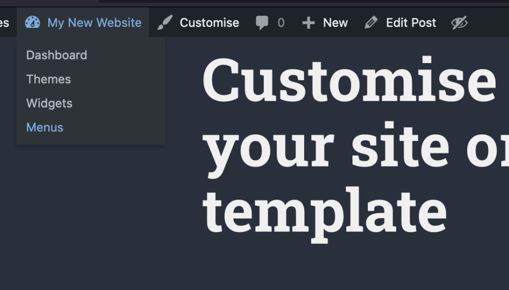
You can access menus in several ways The customizer experience may suit you if you want to see what happens on the live site before you commit to a change. In the example below we have named our menu “Mainly” and moved the item Post Types to appear as a drop down to Blocks. We can drag an drop the items and adjust the hierarchy. You can also see that we can select dfferent template positions. Each template will support at least one position, some will support multiple and do magic things with social menus.
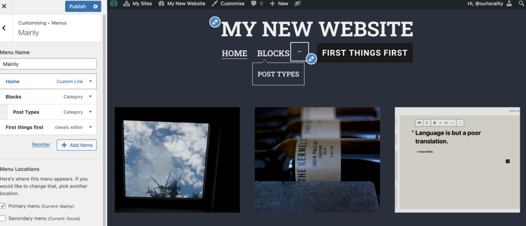
The customizer is handy for preview and for saving drafts As stated in other articles you can back out of changes in the customizer or schedule them for later publication or save them as a draft to return to later or copy the link to share with colleagues before committing.
An important an pwerful feature of the menu navigation tools is that you can easily link to different types of content. A page, to a category or tag (very useful), to a custom link (or a relative #link on a page), an individual post, or even a post format (in this template) or even to another website (but you will be saying goodbye to your visitor – so be wary of offering too many exits). Pretty powerful.
On the other hand if you have a clear idea of what you want and a largish menu to manage the main Menus management tool may suit better. See below to see that you get a full picture of the options for linking.
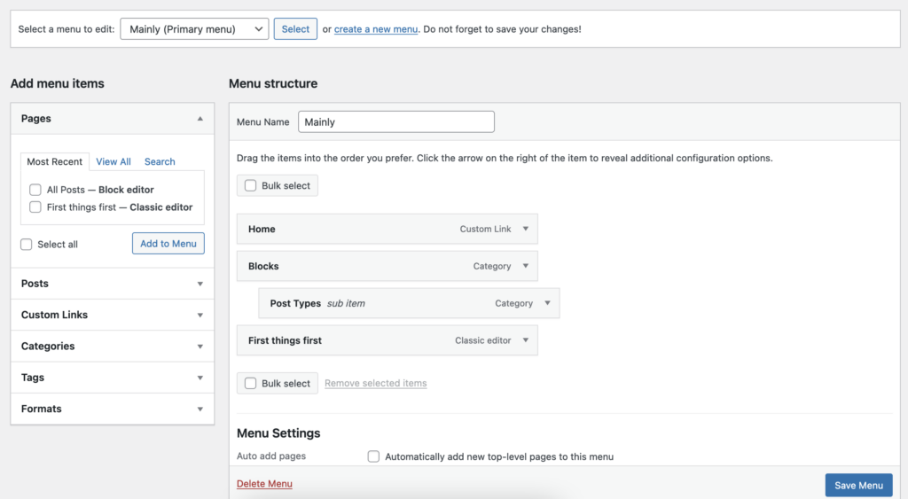
The main menu manager is powerful if you need to manage a complex structure Rookie errors:-
- deleting a page but forgetting to unlink it from the menu
- creating a “new menu” for every “menu item” and puzzling why they do not appear
- and not assigning the menu to a specific template position
- not editing the menu title – say your page title is excessively long
- having far too many top level items cluttering up your header
- having far too many sub menus
- deleting the menu instead of the item (too easy to do, actually)
- Customise key aspects of your site or switch template
To open up the customizer, select from the top bar or Dashboard > Appearance > Customizer. The customizer provides a key route to modifying many of the website fundamentals, e.g.:
- Switch template
- Change colour scheme (template dependent)
- Change fonts and font styles (template dependent)
- Modify menus (you can do this also from the Dashboard > Appearance > Menus)
- Modify Widgets (these are the marginalia like the sidebar and footer, if supported)
- Adjust the front page settings
- Add custom styles (for advanced users mainly)
Some templates will open up a raft of other options, sometimes a little bewildering so choose a simple template if this is your first time.
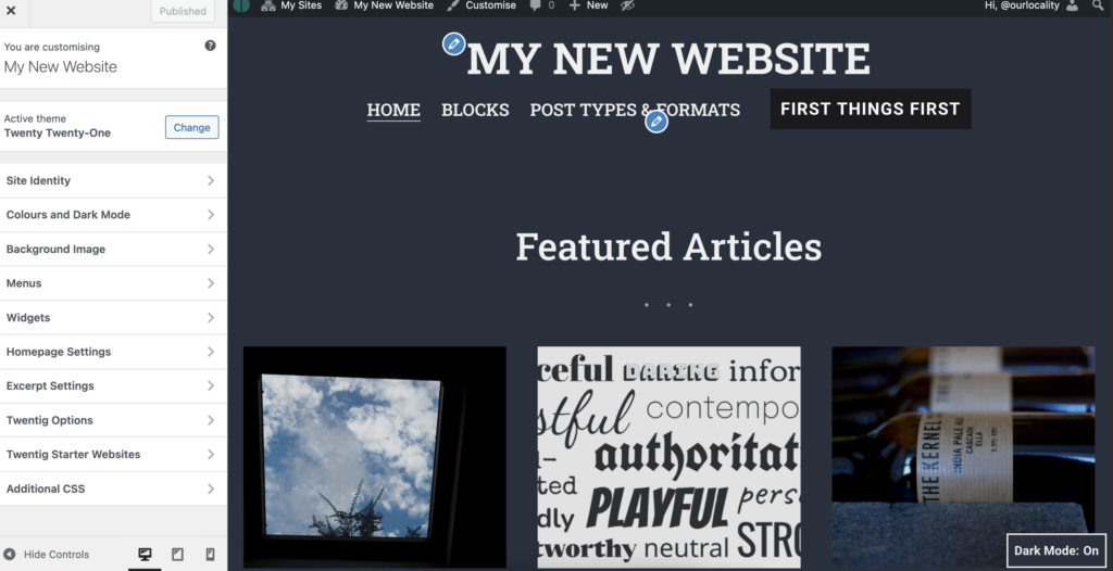
Here’s the customizer with our website showing alongside The customizer’s main feature is the ability to preview the changes on screen before you commit to them. Moreover you can save a draft of your changes, share that draft with colleagues, or abandon the changes altogether later if they are not approved. You can also schedule a change to go live at a later time or date.
Rookie errors:-
- To invest in a complicated template feature rich but is too difficult to customize, let alone maintain
- To create a complex architecture of blank pages to fill with content later …
- To believe time is not your enemy … now is the time and it only runs out!
- This is an Aside
An Aside is a special Post Type that will appear in the news content stream like an ordinary blog post … but without the title, but not in all themes. If not you can design your own aside. Handy if you want your blog to look more like social media stream without the annoying adverts …
- Embed Calendar
With Google Calendar, you can flexibly import external calendars and display multiple calendars on a website.
If you are taking bookings, it can make sense to integrate all the bookings from multiple platforms into a single calendar rather than display multiple calendars.
To prevent double booking platforms like VBRO and ABNB allow calendar syncronisation. But they’d rather you booked through them and often won’t let you embed their calendar directly.
A solution to this limitation is to make your Google Calendar the default publicly visible calendar on your website.
While a bit of manual labour is involved, you can use the public and private visibility options carefully to: a) selectively show a price calendar (which can show basic pricing or offers); and b) display the bookings; and even c) recycling days and d) other useful local information (a simple notice board).
By default an entry in a Google Calendar is private until you mark it either public or “busy”. To avoid accidentally exposing customer data publicly (as illustrated in the frivolous example above) always make the entry “busy”.
If you’d rather avoid the platform (no bad thing) and are actually more comfortable with a little bit of toing and froing before confirming a booking, this is an effective and economical solution. Cancelling a hasty booking made through a platform can be irksome (can tarnishes one’s reputation). But you can save a mountain on transaction fees too.
:-)
If you’d like to try this solution drop the google calendar embed code into an iframe (if the iframe plugin is enabled) – or ask us to enable it for a donation (which helps ourlocality be more sustainable).


