The Art of Readable, Impactful Design
Typography is more than just choosing a pretty font—it’s a fundamental part of how your message is received. The right typography enhances readability, creates hierarchy, and sets the tone for your brand. Poor typography, on the other hand, can make your content feel unprofessional and difficult to engage with.
Guidelines for Great Web Typography
✅ Limit Your Fonts – Stick to 2–3 complementary fonts: one for headings, one for body text, and an optional accent font.
✅ Prioritize Readability – Use clean, legible fonts. Sans-serif works well for digital screens, while serif fonts can add a touch of elegance.
✅ Establish a Clear Hierarchy – Use font size, weight, and spacing to guide the reader’s eye. Headings should be distinct from body text.
✅ Keep Line Lengths Comfortable – Aim for 50–75 characters per line to reduce strain and improve readability.
✅ Use Sufficient Line Spacing – Set line height to at least 1.4–1.6 times the font size for a balanced, airy feel.
✅ Ensure Strong Contrast – Dark text on a light background (or vice versa) improves readability. Avoid low-contrast color schemes.
✅ Be Mindful of Alignment – Left-aligned text is easiest to read for most languages. Centered text should be used sparingly, and avoid justified text on the web.
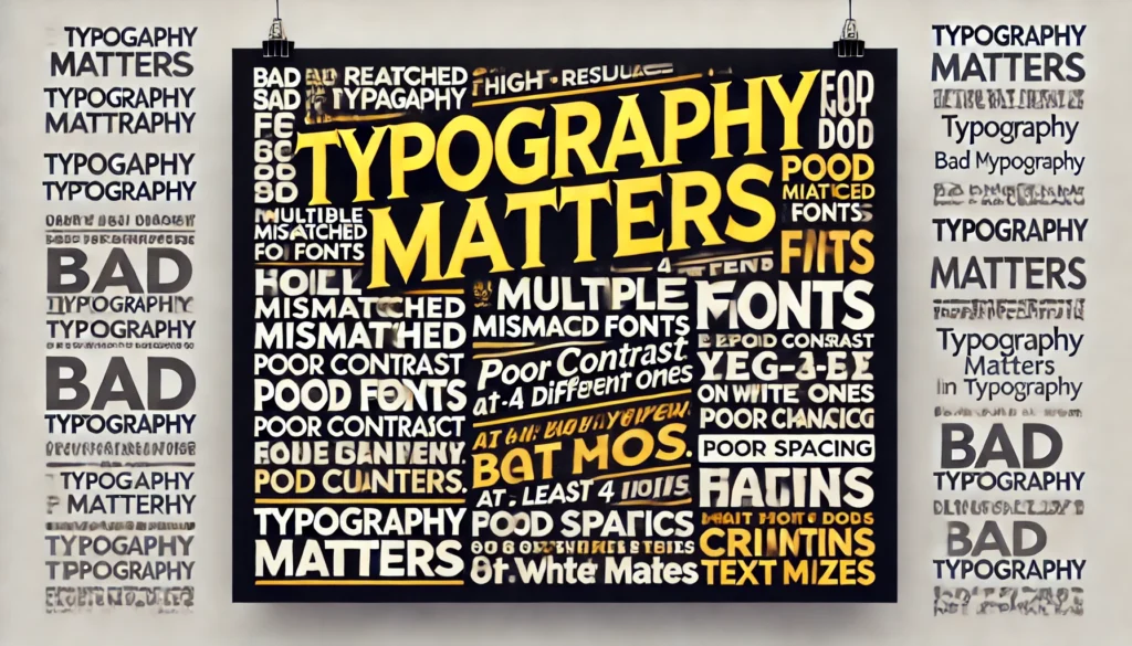
Typography No-Nos
❌ Too Many Fonts – A mix of five different fonts? Chaos. Stick to a disciplined set.
❌ Tiny or Overly Large Text – Small fonts strain the eyes, and massive fonts can overwhelm. Keep body text at a minimum of 16px.
❌ All Caps for Long Text – Good for emphasis, terrible for readability.
❌ Overuse of Fancy Fonts – Decorative or script fonts should be used sparingly, never for body text.
❌ Bad Color Choices – Yellow on white? Red on blue? If it’s hard to read, rethink your palette.
❌ Ignoring Accessibility – Contrast, spacing, and font choices should be inclusive for all users, including those with visual impairments.
Great typography doesn’t shout—it subtly enhances the user’s experience. Keep it simple, readable, and intentional, and your website will thank you for it. 🎨✨